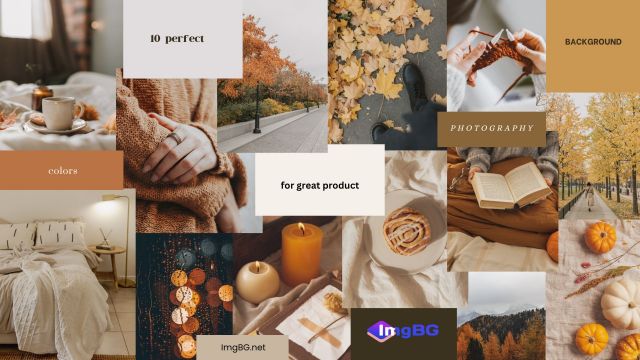
10 perfect background colors for great product photography
- Oct 30, 2023
- 1218
Creating visually appealing photographs that influence customers' decisions to buy doesn't stop with simply producing excellent product shots. It is important to consider other factors, most notably the appropriate background to employ for product photography and design. Making a good and long-lasting impression doesn't necessarily require concentrating on the goods; rather, it is the component that completes the picture that counts.
Product Photography Background Ideas
Your choice of background for product photography will impact the tone and message you wish to deliver to your target audience. Selecting the finest one will help you establish your brand identity and set your goods apart from competitors, in addition to enabling your customers to evaluate your products effectively. Here are some ideal background colors and concepts to help you showcase your brand:
1. Black backgrounds
Jewelry, cosmetics, and electronics are examples of luxury products that frequently employ black as their background color. Its darkest color combinations have always drawn attention right away, but they also draw attention to the object itself, highlighting every last detail. A dark background can convey mystery and style, depending on the product being featured.
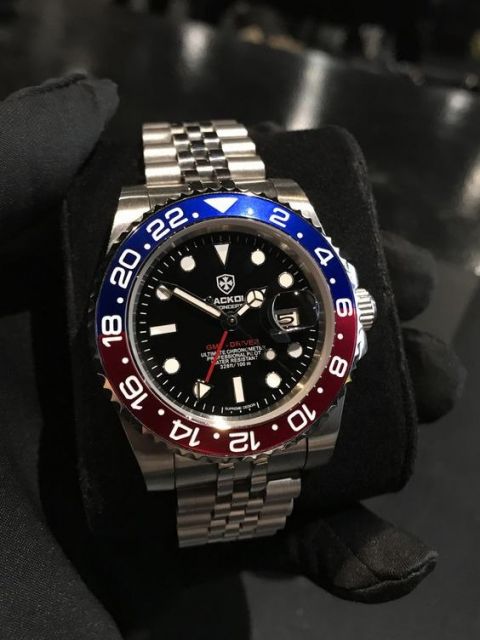
In addition to creating a dramatic effect, the black background looks elegant and refined. It's something extraordinary that lets the products take center stage. In addition, it produces reflections and shadows that enhance the product's appearance and visual appeal.
2. Bokeh
The Japanese term "bokeh" literally translates as "blur." Essentially, the fast camera lens caught the portions of the image that were out of focus. This aesthetic feature focuses our attention on a certain aspect of a picture or product that adds visual attractiveness. This method is frequently applied to produce a distinctive backdrop for product photography.
The Bokeh effect is frequently produced by only emphasizing a particular area of a product photo and by using background illumination. Using it or not, Bokeh helps create a fantastic product picture that is eye-catching and will undoubtedly grab the customer's attention.
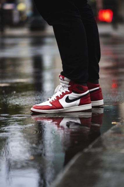
3. Contextual backgrounds
What appeals to the eye is what will pique people's interest in purchasing the item they can already picture themselves owning. The greatest backgrounds to utilize are contextual ones for clothing and accessories. Customers are able to visualize themselves in the same setting or utilizing the advertised product by employing this technique.
Backgrounds in context for product photography
Contextual backdrops help consumers imagine a product more broadly, which ultimately leads them to satiate their curiosity. Choose a contextual background that can enhance human experiences or assist in addressing issues that arise in everyday life. In this way, it will draw attention to the benefits of your product as well as its additional untapped potential.
4. Patterns
The use of patterned backgrounds is usually practiced when presenting multiple products on an online site that wants to achieve a consistent product appearance. Others even turned their own logo into a patterned background to further strengthen their brand identity. While creating a certain product vibe, a neat and elegant website is maintained.

The patterned background also offers an added flair to your product photography and provides extra depth and dimension. Do not let your creativity suffer because background removal will already simplify the initial step. Just be cautious not to distract customers by using confusing background patterns, as it will not be beneficial in creating a good first impression.
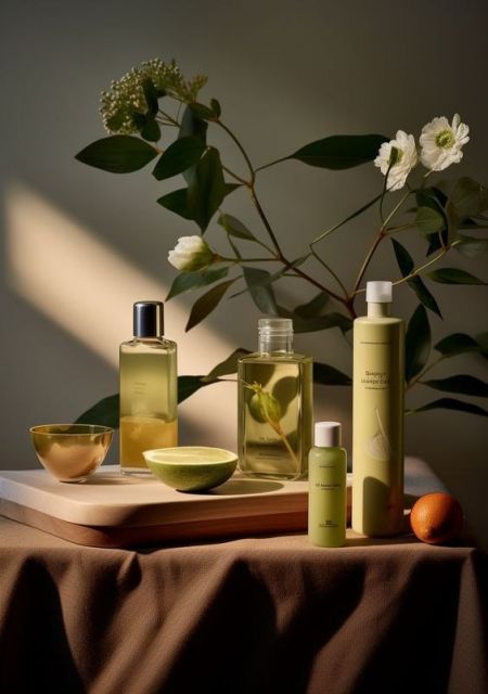
5. Neutrals
Neutral backgrounds are the best option if you think white is too basic for a backdrop but still want to give your images a little adaptability and not too many distracting elements to draw attention to your product. You can experiment with the other accessible features while maintaining a stable and modern style with neutral hues. It simply works for any style and will also help you create any particular branding you may have in mind.
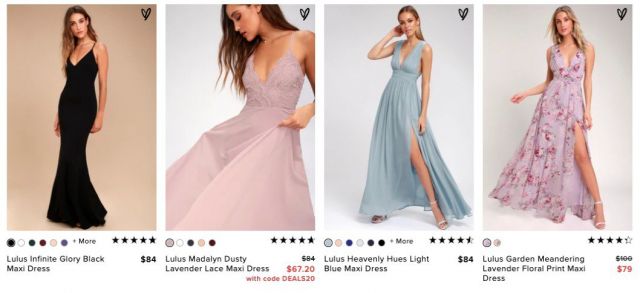
Some may find it a little dull, but with a little imagination, you can make your product stand out against a neutral backdrop by using a brighter color. In practically all situations, neutral hues are also the safest option. It makes viewers feel at ease and makes a good impression.
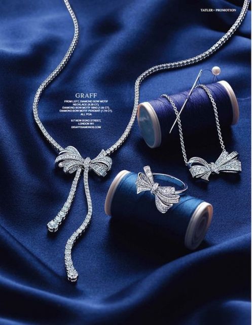
6. Solid colors
Solid-color backgrounds are always a good choice for product photography. Solid colors make a striking, audacious, and alluring visual assault on the human eye. Its vast range of light, dark, and mixed hues ensures that you will never run out of colors to use and experiment with. Every product placement can be designed to be completely complemented by the use of some shadow effects and design twists.
Solid background colors bring life and playfulness to the product, and the use of a two-toned solid color background adds a little dimension to the shots. Solid colors are also used to represent the business brand identity, and through it, the business can gain a good and well-known reputation. It is powerful to use for every idea, and so its potential to bring positive outcomes is limitless for every business.
7. Textures
The use of textures as a backdrop gives product photography a realistic and natural appearance. The smoothness or roughness of an image can be used to highlight a particular area and direct viewers' attention to the main subject of the picture. Texture gives viewers excitement without sacrificing a straightforward, orderly appearance.
Additionally, a texture background conveys immensity, and its breadth enables designers to produce a variety of styles with their own distinctive elements. There are always ideas to utilize as texture backgrounds, and the environment itself can serve as an inspiration. Just bear in mind that when showcasing your business goods on a textured background, you should establish a presence that may instantly grab customers' attention and encourage interaction.
8. Tiles
Using the resources that are readily available to us is inevitable when discussing resourcefulness in design. Tiles are a fantastic backdrop option that even regular people frequently employ to enhance the overall look of their images. The same holds true for concepts for product photos or selecting a trustworthy background color. A lot of creativity can be achieved with tiles, which can lead to various fantastic effects.
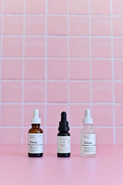
Additionally, tiles come in a wide variety of colors, sizes, and unique patterns that let designers create a unique aesthetic that clients will love. Products are often placed in the middle or in a specific section of the tile, and when they are complemented with additional elements, a remarkable visual experience is produced.
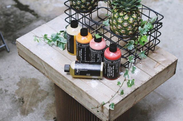
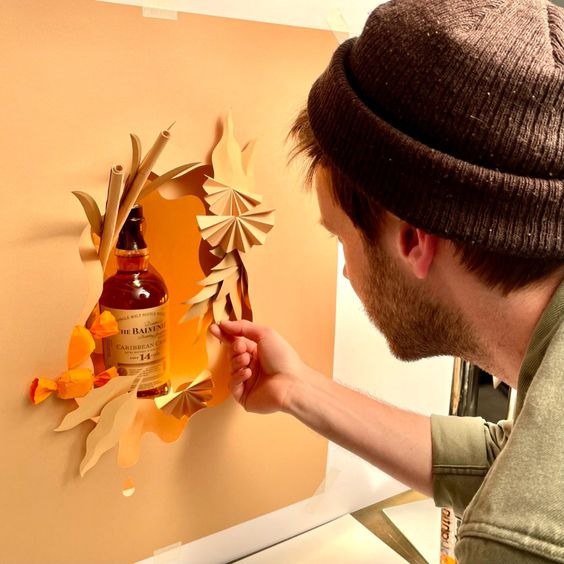
9. Wooden backgrounds
Woods has a lot to offer, even in the design world. Wooden backgrounds evoke feelings of rusticity and earthiness. It displays a realistic effect that harmonizes with the surrounding elements. You can effortlessly integrate the product to get a natural aesthetic and capture the ideal shot because it already has a realistic vision.
The necessary touch of wood can be found in the unused old plank tree, your favorite chair, the dining table, and even the flooring where you stand. There are woods everywhere; therefore, there's always somewhere to attain that amazing aesthetic. Utilize the wooden background to the fullest extent possible—it's definitely worth a go.
10. White
There is so much beauty in simplicity. White continues to remain the best backdrop for any product photo, even though the selections on the list above could argue otherwise given how much they have to offer.
White has the power to enhance every image to its fullest potential. This simplicity gives a clean appearance and keeps things consistent. A white background makes the goods stand out because it has minimal effect on the image. It is ageless and never goes out of style.
Although whiteness implies supremacy, achieving it is never difficult. You can find a lot of free background removal tools useful in this situation.
Psychological Impact of Color on Consumers
Color affects consumer behavior psychologically; did you realize that?
Nearly every area of human life is impacted by color. Due to their upbringing and cultural background, people have different reactions to different colors. Emotions, conduct, and most importantly, our daily choices, including what we buy, are all influenced by color. Research on various people and organizations has shown that emphasizing color psychology is very helpful in building a company's brand.
Color Meanings
Therefore, understanding how people react to a certain color is crucial for designers. And in the end, you'll learn how this might assist in favorably influencing their purchase selections. The lists of colors, together with their real-world applications and associated meanings, are provided below to assist you in assessing each color's psychological effect on consumers.
Warm Colors
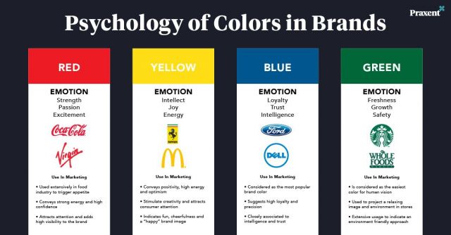
Red: among other hues, is strongly associated with love, passion, and power, which elicit the greatest emotions. In addition to signaling danger and caution, the color red also elicits excitement and violence. Because red is so dominant in competition and is thought to have an impact on winning chances, athletes like to wear red when competing.
Orange: Due to its upbeat atmosphere, this color is frequently used in advertisements to attract attention. It is perceived by people as a vivid and joyful hue. It has a positive vibe, warmth, and enthusiasm.
Yellow: The color yellow comes to mind when we think about sunshine. Bright and cheery yellow is a hue connected to hope. It can be viewed in various ways since it is complex.
Cool Colors
Blue is the most popular color in the world. All of them adore it. Blue is a color of tranquility and peace. It conveys a sense of security and reliability. This color was utilized in offices because it encourages productivity. Men favor blue above other colors since it's sometimes perceived as manly.
Green: The best way to depict the color green is through nature. Green is a sign of growth, prosperity, and fresh starts. It is claimed to aid in attention and enhance reading comprehension. Green is organic and creates a revitalizing vibe.
Blue is the most popular color in the world. All of them adore it. Blue is a color of tranquility and peace. It conveys a sense of security and reliability. This color was utilized in offices because it encourages productivity. Men favor blue above other colors since it's sometimes perceived as manly.
Neutrals
Black: This color absorbs all other colors. Depending on personal inclination and past experiences, black can have both positive and negative impacts. Positively, it's a symbol of style and fanciness. Conversely, it represents death and all things associated with evil and negativity.
White: Flying a white flag is an expression of peace. Among other hues, white promotes focus and serenity. It also denotes cleanliness and purity. This is frequently used by designers to create a feeling of space.
Gray: This color is frequently utilized to give off an elegant and official vibe. Of all the neutral colors, it is the most adaptable and useful. It can also be used to create both traditional and modern styles.
Brown: Brown is a color that embodies the earthy aesthetic, along with green. It is sturdy and exudes fortitude and power. While brown is a traditional color that is cozy and comforting, it also has a feeling of loneliness about it.
When choosing a product, people's preferred hue may have anything to do with the image they want to project. It is largely focused on how we want the world to perceive us or how we want to relate to it. Color psychology unequivocally demonstrates that color has the greatest impact on consumers' decisions to buy, but other aspects should also be taken into account. Age, gender, and product price are other factors that influence people's preferences.