Understanding Color in Photography: A Simple Guide
- Oct 23, 2023
- 1346
What you need to know about color in photography is as follows:
- Color order
- Color scheme types
- Variables of color
- Colors that advance and recede
- Color psychology
- Color composition
- Weather and light
- Equipment and accessories
- Color is used in abstract images.
- Color post-processing
1. Color order
Let's begin with the fundamentals: kindergarten art class. Remember how much fun it was to experiment with different paint colors to create new ones? As it turns out, this is exactly how color works in photography. The sole difference between color theory in photography and color theory in kindergarten is that light utilizes an RGB color wheel, whereas paint uses a CMY color wheel.
All of the colors we see are classified into three groups: primary, secondary, and tertiary. While these categories are not precise, they can serve as general suggestions for using color in your photographs. The closer a color is to a main color, the more attention it will draw to itself in the image. When combined with the other criteria described in this article, you will be able to build compositions that seem balanced and visually pleasing.
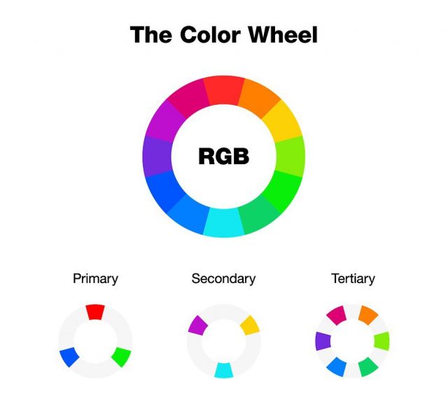
Humans have three types of color receptor cones in their eyes, each sensitive to various wavelengths corresponding to blue, green, and red hues, as you may recall from basic biology class. The primary RGB colors are these three hues, and all other colors in the spectrum are created by combining at least two of them.
02. Color scheme types
To properly employ color in photography, one must first learn how to produce balanced color combinations. Color schemes are widely used to describe these combinations. A set of rules can help you use color schemes to your advantage so that your photographs have a consistent look.
Color schemes are classified into three types: complimentary, analogous, and monochrome. Each of them includes the following:
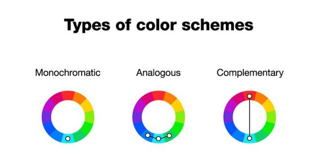
Complementary colors
Remember the "orange and teal look" photography craze that swept the industry a few years ago? The two colors are opposite each other on the color wheel, making them complimentary, which may account for the trend's success.

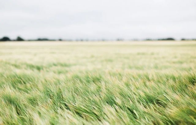
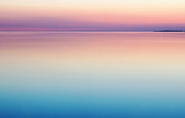
Analogous color schemes are common in nature, making them especially popular in nature and landscape photography. Consider the deep oranges and reds of a fall forest or the blue and green tones of the ocean.

Monochrome color schemes have been one of the most popular in photography Instagram accounts in recent years, as artists strive to give their feeds a unified look and feel.

03. Variables of color
Each hue contains a vast range of tones and tints, transforming a simple color wheel into the entire palette of the 10 million colors that humans can see. Each of the many colors in this vast palette has its own name, tone, and shade, which are defined by the color variables hue, saturation, and brightness. These variables are often known as HSL.
Hue
The radial position of a color on the RGB color wheel is referred to as its hue. It specifies the color's name, such as red, yellow, blue, or purple, and is shown in degrees ranging from 0 to 360.

04. Colors that advance and recede
Warm hues tend to stick out and catch our eye immediately. As a result, danger and stop signs are frequently yellow or red. As a result, warm colors in photography are sometimes referred to as progressing colors. Cool colors, on the other hand, fade into the backdrop and are referred to as receding hues.

05.Color psychology
Color can elicit the following emotions:
-
Red: passion, anger, strength
-
Orange: cheerfulness, vitality, fun
-
Yellow: happiness, warmth, joy
-
Green: nature, health, calm
-
Blue: balance, sadness, coldness
-
Purple: wisdom, loyalty, spirituality
-
Pink: playfulness, compassion, sweetness
06. Color composition
When discussing photography composition guidelines, it's typical to focus solely on shapes, numbers, and subject placement. Color, on the other hand, is as important in your compositions as any other aspect of the picture. Color in photography has the same impact as tangible items because we see different hues in the same way we see subjects. Colors can thus be used as leading lines, natural framing, negative space, patterns, and to add depth.
07. Weather and light
Blue light begins to illuminate the day as the sun approaches its dawn position. As the first rays of sunlight reach the earth, the warm tone of the golden hour takes over. The color of light changes with each passing hour, depending on the weather.

08. Equipment and accessories
- Polarizing lens: Polarizing filters, in addition to decreasing glare from reflecting surfaces, boost color contrast and saturation. This brings the colors far closer to their natural appearance, reducing the need for post-production.
-
RAW files: RAW files save images with no compression and minimum processing, giving you complete control over the image editing process. Nowadays, raw data may be captured with almost any camera, even smartphone cameras.
- White balance is one of the most generally disregarded camera settings, although it has a significant impact on color in photography. Various light sources have varying temperatures, and each casts a different color. By using the correct white balance option on your camera, you can ensure that the colors in your photograph remain true to life—or to your vision.
9. Color is used in abstract images.
Color is especially essential in abstract photography. As people and scenes become unrecognizable, the image's various hues become the subjects of the shot. Capturing abstract images may teach you how to use different colors to create balanced compositions, as well as how to use diverse hues as composition aspects.

10. Color post-processing
Color correction is a key stage in post-production. The options available in free photo editing software packages are practically limitless, allowing you to fine-tune every small element required to bring the real colors of your photographs to life. Despite, or perhaps because of, its accessibility, many photographers struggle with color correction.
Knowing when to stop is one of the most crucial aspects of color post-processing in photography. Instead of making the colors brighter and more intense to make them stand out, try to make them as true to reality as possible. Another crucial point to remember is that your photographic style should not be dependent on changing colors beyond recognition. If you're tempted, consider what the orange and teal trend achieved for landscape and portrait photography.